User Interface
Overview of Designer's UI elements. Check the linked documents for more detailed information.
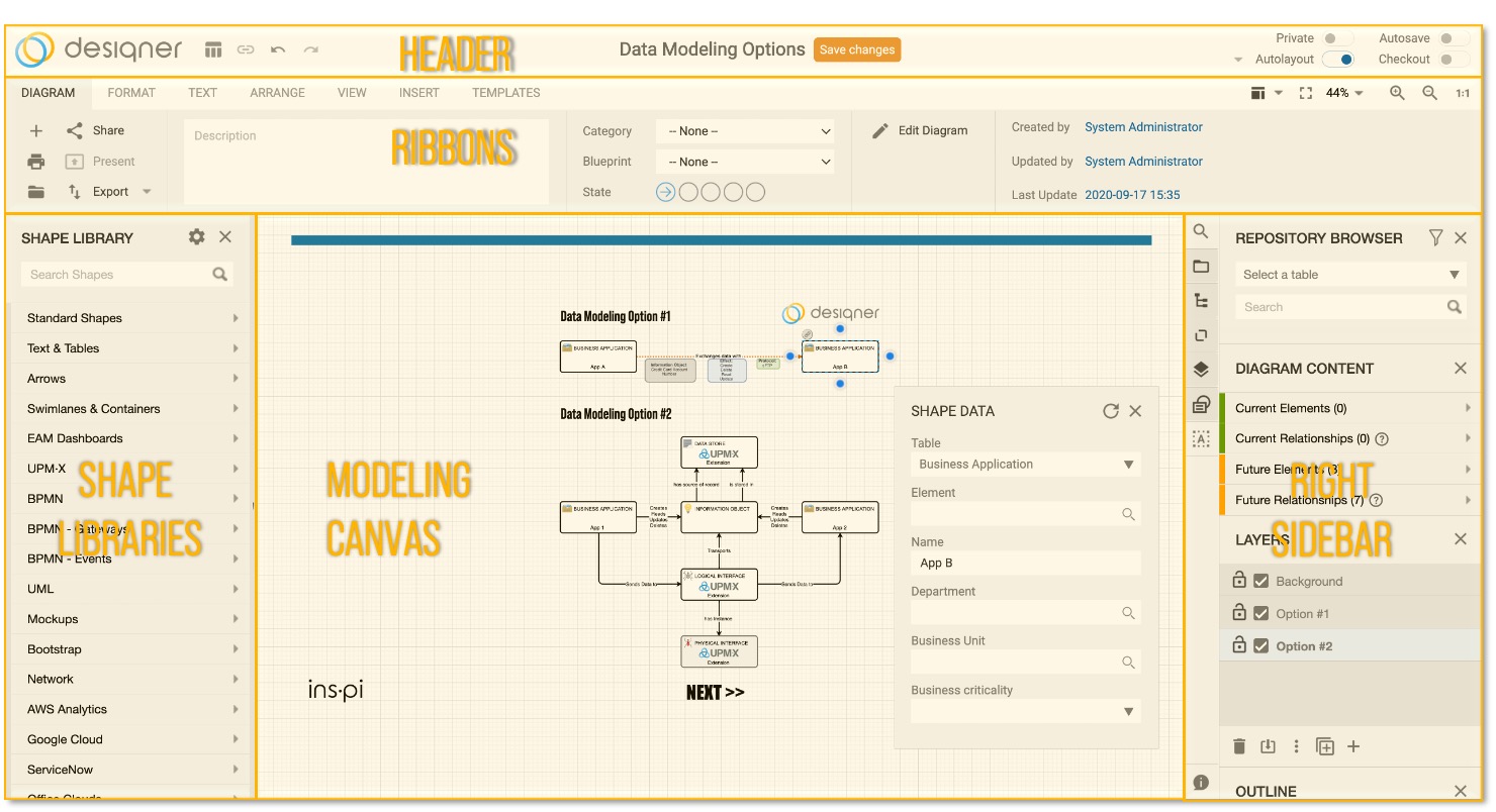
The Designer environment is subdivided into eight (5) main areas of functionality:

Designer Environment
HEADER
Contains main functionality to open the diagram form
Copy diagram link for presentation mode
- Undo/Redo
- Change diagram name
- Save (CTRL+S)
- Make diagram Private
- Switch Autolayout on/off
RIBBONS
The ribbons section provides the main application menu which provides quick access to important features within the Designer e.g.:
- Multipage printing
- Open diagrams
- Share diagram link
- Open diagram in presentation mode (read only)
- Export diagrams as PNG/SVG
- Format shapes, text and relationships
- Fullscreen
- Zoom options
- Indicators
- Personal and global templates
SHAPE LIBRARIES
- On the left hand side are the shape libraries. Shapes are grouped and displayed within a shape library, which can be tailored by the Designer Admin.
- Clicking a shape causes an instance of that shape to appear in the diagram. Clicking and dragging a shape allows you to position the shape anywhere in the work area.
- The first library to be displayed is the Standard Shapes library, which is located at the top. Each tab below Standard Shapes corresponds to a different library, which can be configured through the More Shapes Library selector. Clicking on any tab will display the shapes for that library.
MODELING CANVAS
- The modeling canvas is the main area to create your diagrams and models.
- Click or drag & drop a shape to the library to start drawing a diagram or model, or use elements from ServiceNow via the Repository Browser.
RIGHT SIDEBAR
- Access any ServiceNow table via the Repository Browser
- The table picker shows tables defined in the Class Definition table.
- Select a table to perform a search on the selected table.
- Enter a text into the search field to receive the search results, or just use the "*" and press enter to receive all results from the selected table. Click or drag & drop the search result to add a shape with the content in the drawing area.
- The styling from the Class Definition table will be applied.
Missing Class DefinitionsWhile loading relationships from the repository, content will appear only white with black text for those, which are not defined in the Class Definition table and/or do not have a style definition.
- Distinguish between committed and not committed (future state) elements in the Content Browser
- The content browser will show the content of the diagrams separated in committed elements and relationships i.e. those which exist as an instance in a ServiceNow table, and not committed elements and relationships i.e. those which do not exists yet in ServiceNow, but where a table (for elements) or a type (for relationships) have been selected.
- It is possible to create a diagram that contains different layers of elements. Each layer and its elements will display together (unless you specify otherwise), but is treated as being completely separated from the other layers as far as editing is concerned.
- Outline provides a useful way of navigating through large complex diagrams. Selecting this option causes the Outline Panel to appear. Clicking and dragging the miniature page shown in the Outline Panel will also move the main page. The part of the miniature page enclosed within the blue frame corresponds to what you can see in the main page. This function is also available from the Toolbar.
Updated 12 months ago
What’s Next
